How to make Artist Trading Cards
Do you want to make artist trading cards (ATCs), but you're not sure how to go about it? We'll tell you what you need to know, and you'll soon be creating and trading these miniature works of art.
The story so far...
In the first part of our look at how to make artist trading cards we talked briefly about the basics, and about ways to create backgrounds using a variety of materials and techniques.
Now let's take a look at the foreground elements: the main subject (or focal point) and embellishments. The main subject of an artist trading card is also referred to in more general terms as the theme of the card.
How do I choose a theme?
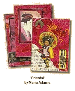
If you are a member of a swap group, and taking part in a pre-arranged swap, the theme is usually decided in advance, but when you make artist trading cards 'just for fun' or for a possible future swap, it can sometimes be difficult to decide what the theme of the card should be. As we have said before, the list of possible subjects is endless!
One possible source of inspiration is the background. When we talked about how to create backgrounds we suggested keeping a lookout around you for sources of card with interesting patterns and textures, giving the example of a 'takeaway menu' which provided the inspiration for a series of cards on an Oriental theme.
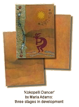
Some artists like to create a number of backgrounds at a time for future use, perhaps using a particular technique or combination of techniques.
If you do this, you may find when looking through your stock that one of them suggests something to you: perhaps a mood, a time or a place. This could be a time in your own life, or a time in history; a place you have visited, or maybe a place you would like to visit. Does it bring some images to mind, and would one of these make a suitable subject for your card?
Another source of inspiration is what is happening in the world or your own life at the moment.
Is there a book or a film that you have particularly enjoyed, or do you have a special interest that inspires you to create a series of artist trading cards? Perhaps you have seen a picture in a book or magazine that has suggested something to you. In this case, of course, you will need to create a suitable background to complement your chosen subject.
Themes which are popular with many of those who make artist trading cards include travel, time, 'vintage' and nature, and in particular butterflies and dragonflies.
Focal points...
The focal point is the most important element of the design of the artist trading card, and is usually an image or object closely related to its theme. It could be a picture taken from a book, magazine or piece of fabric, or maybe a stamped image; perhaps a found object (or objet trouvé) like a key, shell or feather, or a created object, like a casting made from polymer clay or ultra-thick embossing enamel, often abbreviated to UTEE.
Embellishments...
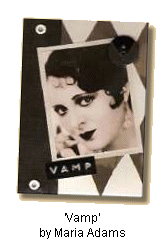
Embellishments are images or objects which are complementary to the focal point, but perhaps less closely related to the theme of the card. A small Chinese coin attached to a card with an Oriental theme is obviously closely related, but other embellishments may be purely decorative in nature, like a button in a toning or complementary colour. In this example not only does the black button fit the overall colour scheme, but it also has a triangular motif which echoes the diamond pattern of the background.
Some embellishments that you may like to try are:
- Printed or stamped images
- Torn papers or vellum
- Tickets
- Ultra-thick embossing enamel (UTEE)
- Polymer clay
- Paper clay
- Shrink plastic
- Friendly Plastic®
- Watch parts
- Bottle caps
- Coins
- Scrabble® tiles
- Dominoes
- Shells
- Postage stamps
- Tags
- Tickets
- Brads and eyelets
- Press studs (snaps)
- Decorative paper clips
- Buttons
- Beads
- Sequins
- Punchinella (sequin waste)
- Charms
- Gems
- Lace
- Fabric
- Ribbons and fibres
Some types of embellishment, like brads and eyelets, may be used both to decorate and to secure other items to the trading card.
One thing to consider when you make artist trading cards is the requirement of most swap groups that they are thin enough to fit in a standard trading card sleeve. This means that whilst the cards may include three-dimensional elements like shells, buttons and charms, you will need to choose examples which are not too bulky.
It's only words...
Although it's not essential, many people who make artist trading cards feel that their work is not complete without some text.
It could be a single word, a short phrase, or perhaps a longer quotation, related in some way to the theme of the card. Often it may be associated with travel, either in the physical sense or in the sense of a journey through life, or with the emotions.
There are many ways to make or obtain text for your artist trading cards.
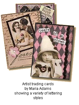
You could cut or tear letters, words and phrases from newspapers, magazines or old books. If you have a computer and printer you may be able to create exactly what you want using a word-processing program. Your computer will probably come with many standard fonts, but there are also a wide variety of interesting and attractive fonts available for download from the internet, either completely free or free for personal use only.
Another good way to produce lettering yourself is with a Dymo® machine. You can use the plastic tape 'as it comes', but why not cut it up into individual letters and arrange them on your card?
Some manufacturers of rubber stamps produce sheets of unmounted stamps which are particularly useful to those who make artist trading cards and are looking for a variety of suitable words and phrases. Other items available from the trade include stickers, both plain and domed, and often you will find books of papers or vellums containing something appropriate.
We've now looked at all the different elements that you might want to include when you make artist trading cards.
So how do you go about arranging them?
Composition...
In their booklet Miniature Marvels: the complete guide to Artist Trading Cards, Daphne Roberts and Trish Latimer describe composition as 'the arrangement of elements within a confined space to give maximum impact with a degree of balance and proportion'.
Whilst it is more usual to make artist trading cards in portrait orientation, rather than landscape, it's entirely a matter of personal preference, and of what suits the theme of your cards.
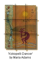
When arranging the elements of your design on the card, don't feel you have to cover the background. Don't be afraid to use blank space; sometimes it really is a case of 'less is more'.
Another thing to remember is that it's best not to make your design too symmetrical. With artist trading cards, as with other similar forms of artwork, moving the main subject away from the centre often works better and gives a more interesting composition. A good tip is to place your main design elements about one third of the way in from the edges. When you have all your elements roughly in place, move them around a bit until the design looks 'right'.
Want to know more?
We continue our look at how to make artist trading cards with finishing, storage and display...
Altered Art Home » Artist Trading Cards » Make Artist Trading Cards


Enjoyed your visit? Why not leave a comment?